At Sauce, we’ve had the same logo, colours, typography, and visual elements for more than six years now. In that time, we’ve grown as a company, both in the scale of projects and the number of team members, but we've also matured into a business that cares about its staff’s wellbeing, and most importantly, we’re a company that takes the ideas, time, and security of its clients seriously.
We now have 30 plus staff members who have a wide range of skill sets and disciplines behind them, from UX/UI design, technical support, front and backend development, operations, QA, and HR. We also have trainees and a longstanding relationship with Ron Dearing UTC.
Over the years, working on interesting and diverse projects, we realised that what makes us special is our people, our team. Their knowledge, their ability to problem solve and deliver consistently good software, is what changes people's lives. We value UX as a means and way to improve our output, but also as a culture within our whole team. It’s a process, and it never stops, but it does show tangible benefits within our projects.
Our identity, we felt, didn’t take all of this into account and could do better. So, we started the ball rolling for a refresh. This naturally created anxiety, designers felt a lot of responsibility, but the wider team wanted to actively participate in it and feel included too.
We created a few ground rules so that the whole team knew what to expect and could get involved.
- This is a refresh, not a reset, we want to keep the existing aesthetic, but address pain points and areas that fall short and fix them.
- Add more colour to our identity, but don’t lose our already established colours. The aim is to use additional colours to accent our base and give us more tools to be creative, visually and socially.
- Put people at the forefront of our visual identity, and give them a voice.
- Expand our identity to cover marketing material and social networks, with clear guidance and documentation on how and when to use what. We do this, so team members not only know what to use and have the assets available. The whole team know what to expect too.
Laying the ground work
First off, we created focus groups with designers and stakeholders (The Chiefs) to create common ground and set some milestones and expectations. Doing this, gave us time to carry out internal surveys and meetings to ask questions like;
- Can you relate to the Sauce identity?
- Do you feel it belongs to you?
- What do you think our identity says about us?
- What are our values?
- Have you seen something, and not liked it?
Also, we addressed the visual elements of our identity that have become problematic over the years, this included;
- Not identifying when to use certain colours correctly in presentations, marketing material and documents? We have brand guidelines, and usage documents, but those weren’t clearly interpretable with the growing range of document types.
- The logo not being legible at a smaller sizes.
- Lack of personality within our font.
- Lack of direction with our photography.
Refresh not a reset
Our logo, fonts, and colours were the first to be addressed. With our logo, we all agreed that it was unique, recognisable, and cool. As any good logo should be, it also shouldn’t be hard to read at smaller sizes, and the colours on the logo can’t lose their impact depending on where they're used. And, something that it wasn’t originally set out to do, is look like brackets used in coding languages. It’s a nice thing that a logo associates itself with industry traits, but we’re not a start-up anymore; we’re an SMO with a diverse set of professions and skills. So, our logo can’t be marginalised like that.
We created a logo that was clearly based on the old version, but did three things.
- The brackets were simplified, so they wouldn’t at first glance, look like those brackets used in coding, but could be something used throughout the identity if needed, to create something unique.
- Bolder is better. We made sure that at smaller sizes, the logo was more legible, so none of the visual elements were lost to pixelation.
- The mono and duo colour versions usage was clearly defined, but also, in all variations, had the same impact as each other.
Our font family is Gotham, and Gotham for a reason. It’s delicate when needed, bold as always, but in CAPS, shouty and refined. It looks good, but lacked personality, especially on the website. We needed another font to compliment it, so that we could amplify when we want to say something, in other words, humanise our fonts.
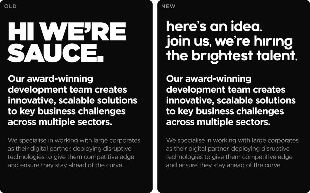
We scoured the internet like all designers do, looking for a font that we liked, but really, all we wanted was a way to give Gotham more personality, that's when we found Megat. It had the same stress, stroke weight but also, the quirkiness needed to add some flair. Introducing a new font, meant we didn’t have to shout using all CAPS anymore, which was a win for everyone.
The Sauce colours have always been black, white and yellow with a flash of grey. Nothing more. Can you emulate the vibrancy of your team with black, white and Yellow? No, not easily. So we wanted to introduce a set of colours that would only ever, accent the base colours, when using it on social media or the website and in presentations and internal documents.
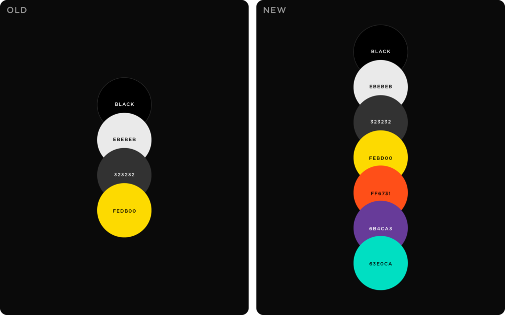
We introduced three new colours based on our yellow using a triadic colour scheme, In English that’s three colours all vastly different from themselves, but if used in a certain way, would compliment each other. The intention was to create visual building blocks that could be used on their own, or in tandem or not at all, based on the foundation of our original colours. Sounds simple. And in most it was, we just had to make sure, the colours never clashed or made our already established colours void.
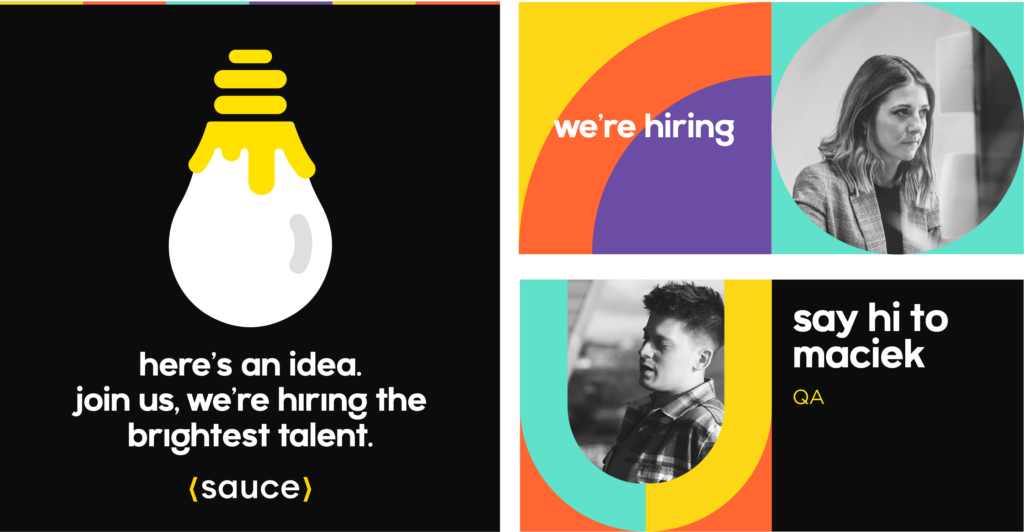
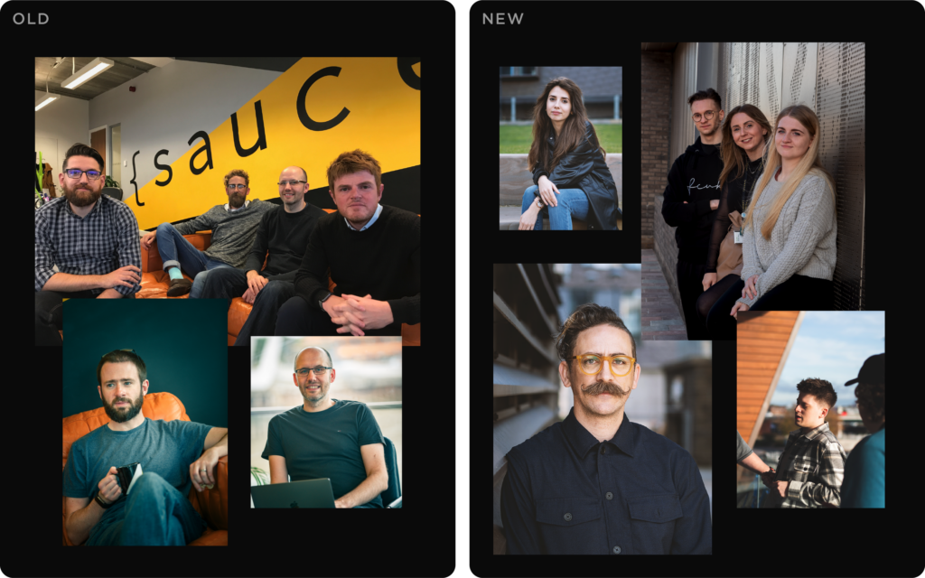
At Sauce, we are known for having a cool, fun meet the team page and for the last few years, we have tried to outdo each other with wild food photos, with some success and some that will never be mentioned, ever. But we simply couldn’t reuse those images throughout our identity, they live there, and that’s it; they have a purpose, and that’s to be on the meet the team page. So over the last few years we’ve hired photographers and with our phones too, we've created a suite of imagery, but what was clear was that we had the big team shots and standard PR pics, but nothing that felt personal or individual to the people at Sauce. The identity, if it were to succeed, would have to feature art-directed photography of individual staff members and organic group shots to convey the atmosphere in our office.
So we made mood boards and hired a good photographer with the sole purpose of using these images to humanise our identity. We focused on candid portraits, organic settings, the use of angles, and view finding to have a wide range of images that could be used on the website and in marketing and internal material.
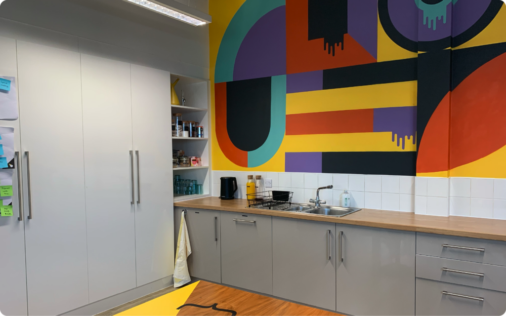
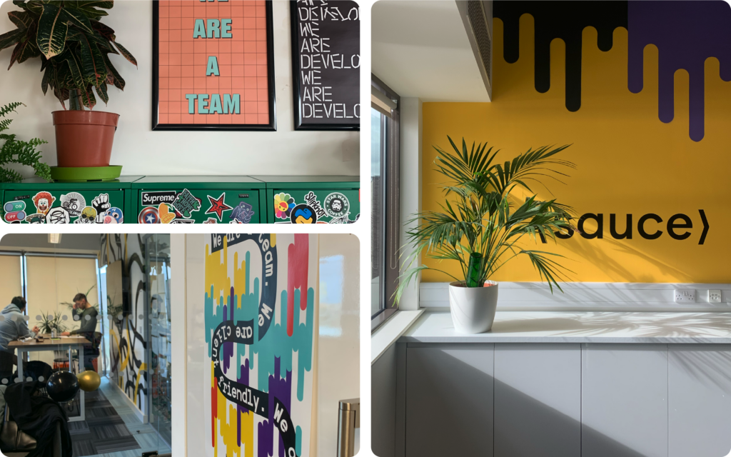
We also introduced these new visual elements into our office space. We hired Spray Creative to bring our walls to life through bright, vibrant murals. Seeing our identity on walls with the layering of colour and texture had a surprising effect; it made our colours feel more tactile, something a primarily digital identity lacks.
The addition of various signage and posters also gave us another way to make our identity feel more personal to the whole team without feeling overbearing.
Final words
Our identity was not done to reinvent ourselves as many growing agencies and studios do, but rather to allow us to show more emotion, and character where possible. It did mean we evolved into something new, but we've tried throughout our journey as a company to retain what makes us Sauce. We're not a branding agency, but we understand that relationships and perceptions are grounded in good design.